Currently funding on Kickstarter, TERRITORY is a post-apocalyptic kaiju story set in a far distant Pacific Northwest of the United States. The comic book is written by Blake McCarthy with art by Chris Sassman, colors by Ichsan Ansori and letters by Marco Della Verde. The campaign is for Issue 3 but includes a chance to pick up books 1 and 2 as well : - https://www.kickstarter.com/projects/bmccomics/territory-issues-1-3-a-post-apocalyptic-kaiju-epic
You can also read a free preview of TERRITORY at GlobalComix: https://globalcomix.com/a/blake-mccarthy/comics
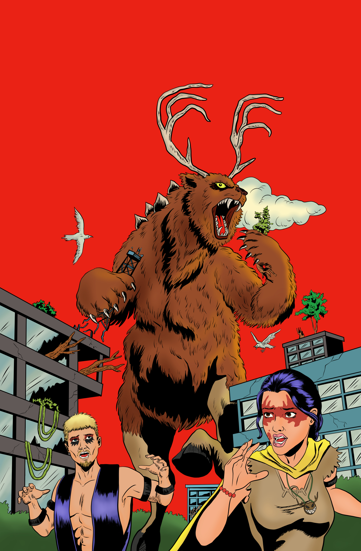
I was thrilled to do a variant cover for the comic. Given the Kaiju theme of the book, Blake wanted a cover based on Herb Trimpe's iconic Godzilla #1.
Here's the process:

The kaiju from TERRITORY is called Greathorn and is a huge antlered bear with hooved hind legs. Proportionally he's the inverse of Godzilla, with all his mass at the top, so that brought some compositional challenges. Also, there's no planes in the TERRITORY future and Greathorn doesn't have atomic breath so I had to come up with some alternative ideas for those. We went with giant birds and some trees as they fit with the story. I substituted the main characters Alkia and Neebo for the people running in terror. Finally, I changed up the buildings a bit to fit with setting of the comic.
I did two sketches (see below) to figure out the compositional differences. We decided to go with ripping up trees rather than the 'ROAR'.


 |
| Cover with color (plain version) |
 |
| Cover with color and dots. |
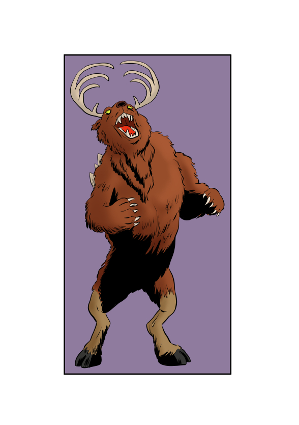 |
| Greathorn corner box art |
Then the art was sent to Flops comics (https://www.instagram.com/flopscomics) who did an incredible job adding in the dressing and some aging effects to bring it all together! Here's the finished piece:
 |
| The final cover - Ta-Dah! |
Comments
Post a Comment